Transactional statement with table or matrix

Julian
Updated on June 26, 2025 in

Hey everyone,

I’m working on a Power BI report and could use some help figuring out the best way to visualize order details.

Note: The real use case I’m working on is a bit more complex and domain-specific (finance related), but I’ve simplified it here using an order/orderline example that structurally behaves the same.

Order dimension → contains OrderID, date, customer info, etc.

  • OrderLine dimension → contains OrderLineIDOrderID (1 order → many lines)

  • A fact table → contains OrderLineID and columns like:

    • Amount

    • Discount

    • Tax

    • etc.

All relationships are properly set up, and granularity is at the OrderLine level.

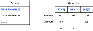
When I select an Order, I want to show a matrix where:

  • Each OrderLine is displayed as a column

  • Each attribute (like Amount, Discount, Tax) is listed as a row

  • The intersecting cells show the actual values

See the example attached.

  • 1
  • 51
  • 1 month ago
 
on June 26, 2025

Hey! 👋

Great question—this is a super common scenario in financial and order reporting where you want to pivot data horizontally across line items. You’re essentially trying to transpose the usual matrix layout, and Power BI isn’t natively wired for this kind of layout (order lines as columns and measures as rows), but there are a few ways to pull it off.

Here’s a couple of approaches you can try:

Option 1: Dynamic Matrix via UNPIVOT (Best for Static Number of OrderLines)

  1. Create a calculated table in Power BI using DAX or do the transformation in Power Query:

    • Unpivot your fact table so you get:

      nginx
       
      OrderLineID | Attribute | Value

      where “Attribute” is like Amount, Tax, Discount.

  2. Use a Matrix visual:

    • Rows: Attribute

    • Columns: OrderLineID

    • Values: Value

This will get you the exact format you’re asking for—attributes on rows, each OrderLineID as a column.

Just keep in mind: this works well if the number of order lines is limited or predictable. If it’s too dynamic, the matrix can become messy or too wide to read.

Option 2: Use a Pivot Table in Excel via Analyze in Excel

If this specific layout is more of a presentation requirement, you could offload the visual formatting to Excel via the “Analyze in Excel” option from Power BI. It gives you more layout freedom and works well if the dataset isn’t massive.

  • Liked by
Reply
Cancel
Loading more replies